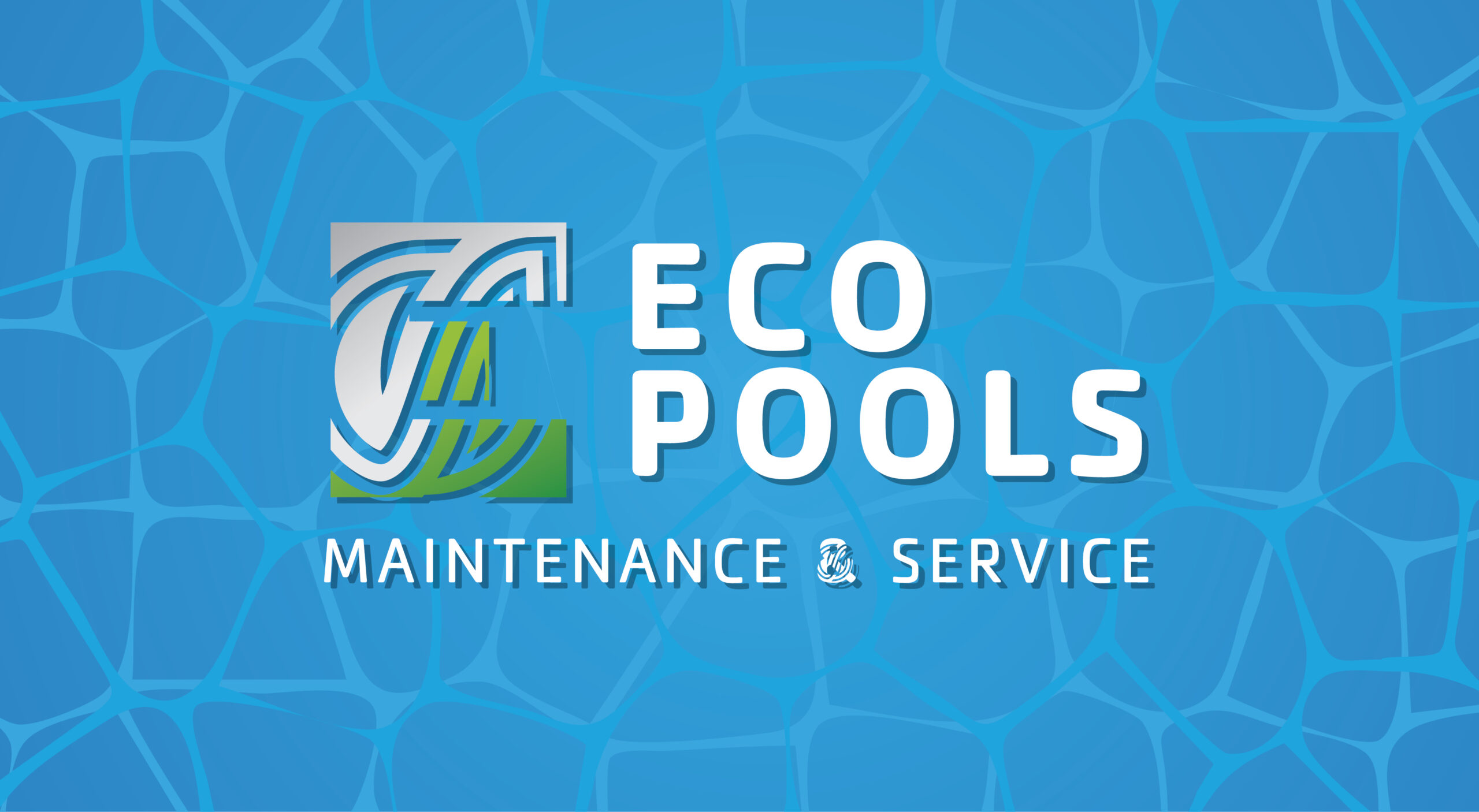
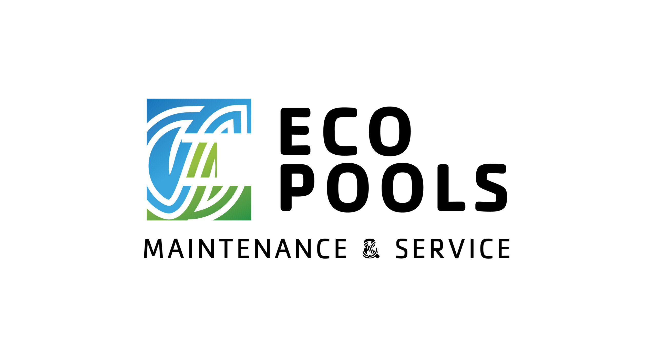
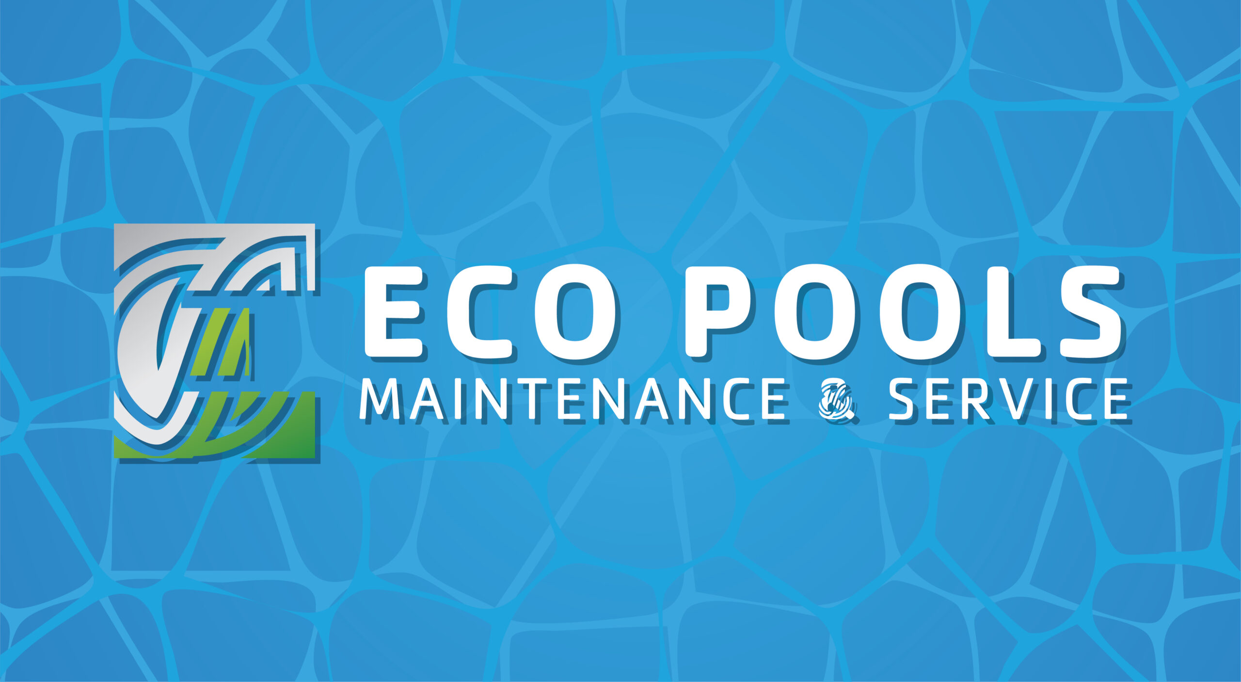
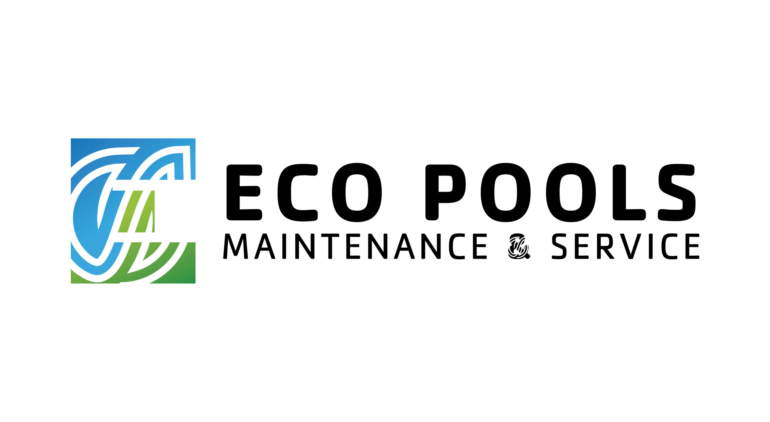
I had the opportunity to lead the branding for a new eco-conscious pool cleaning business. The client was in the early stages of launching their company and entrusted me with full creative control over the visual identity. The goal was to develop a logo and branding system that communicated both cleanliness and environmental responsibility.
Concept & Results:
With a focus on sustainability, I created a logo that cleverly uses negative space within the letter "E" to suggest motion and water flow. The surrounding pattern draws inspiration from the familiar recycling symbol, reinforcing the brand’s commitment to eco-friendly practices. A color palette of blue and green was chosen to symbolize water and nature, aligning with the client’s mission. This project was a great exercise in minimalist design with meaning, and I’m proud of how effectively the identity communicates the brand’s values. It was rewarding to see a concept evolve from the ground up, and the final result struck a strong balance between professionalism and environmental appeal.