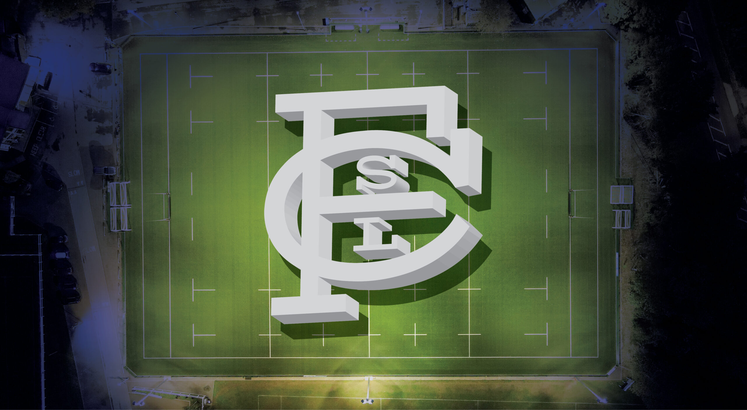
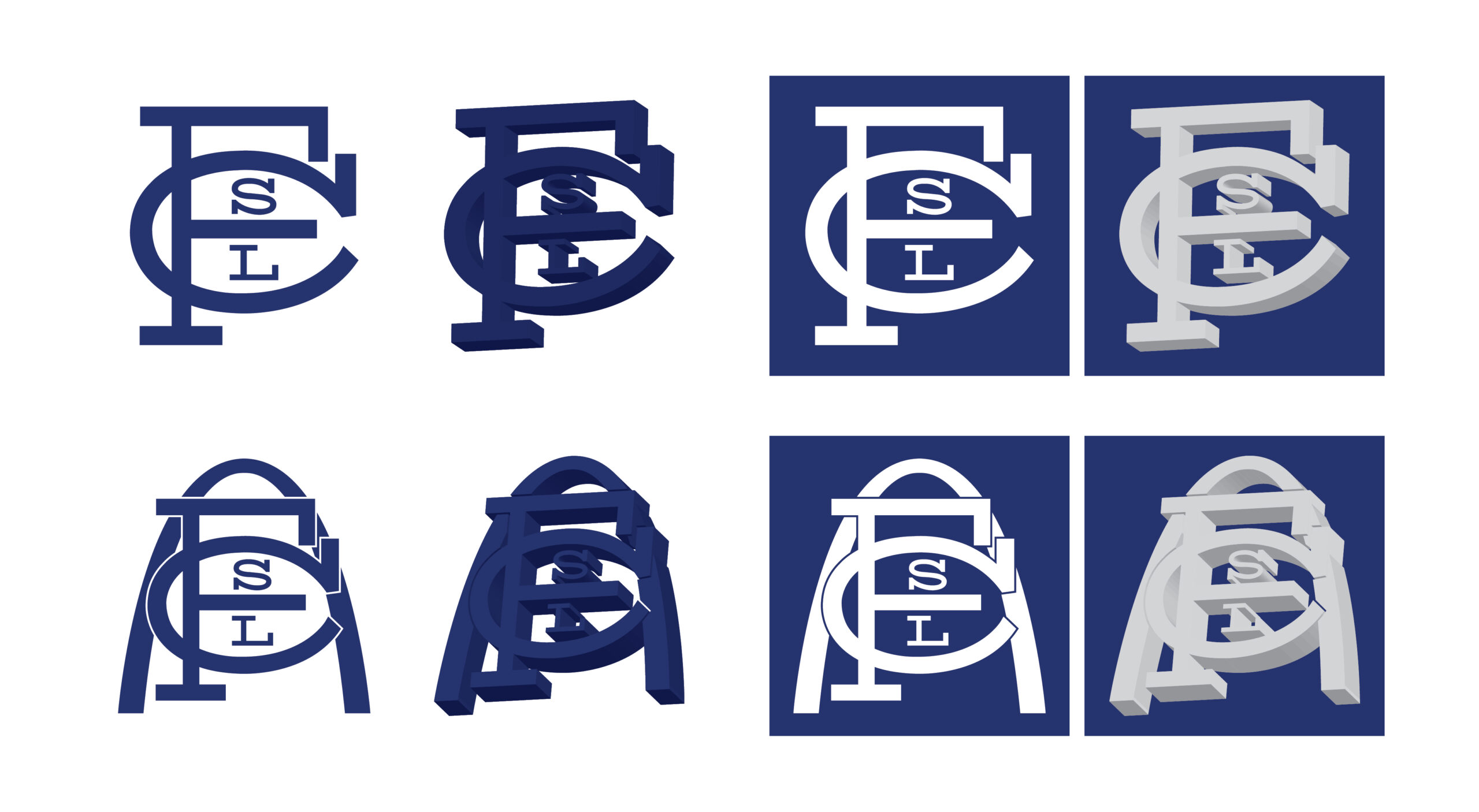
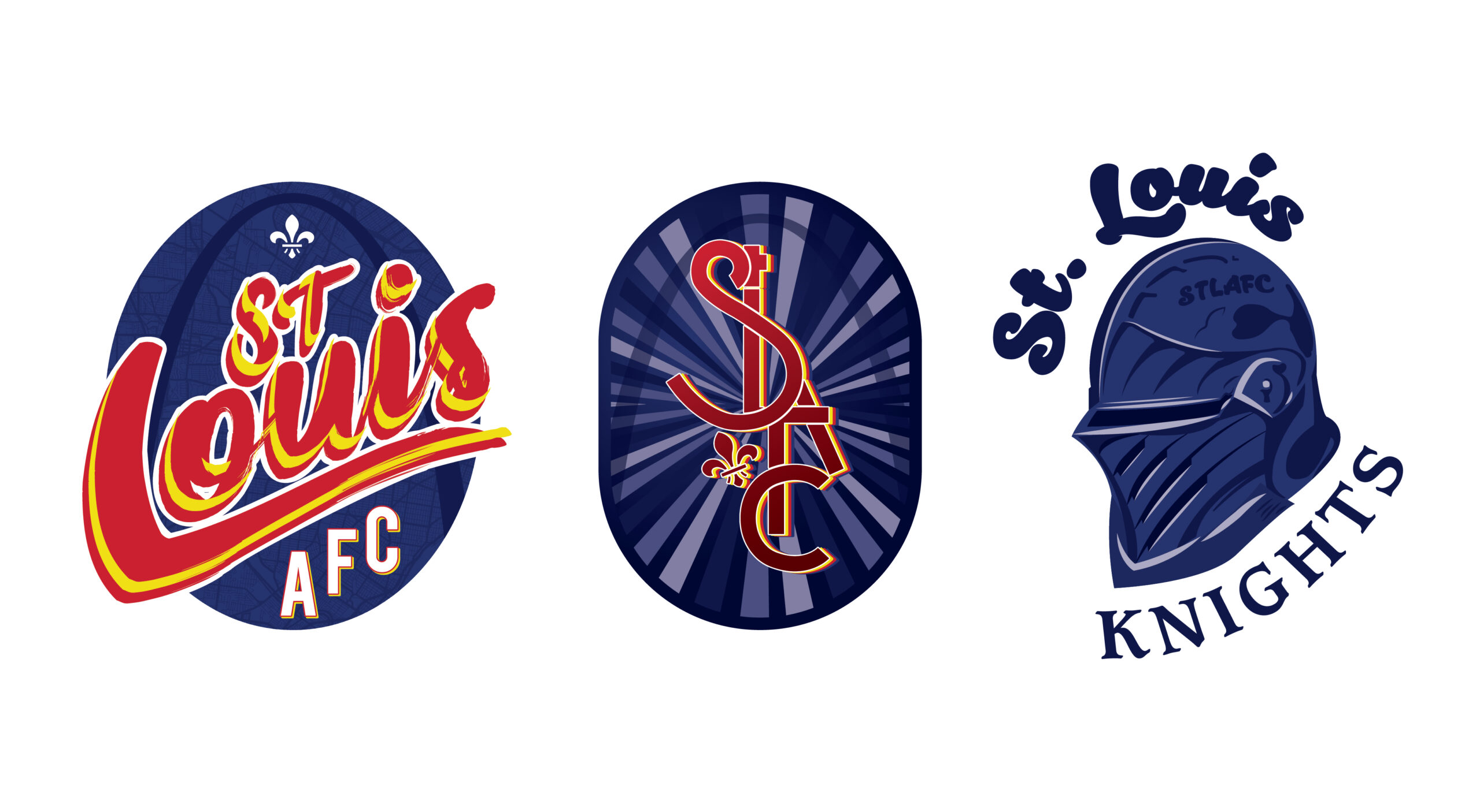
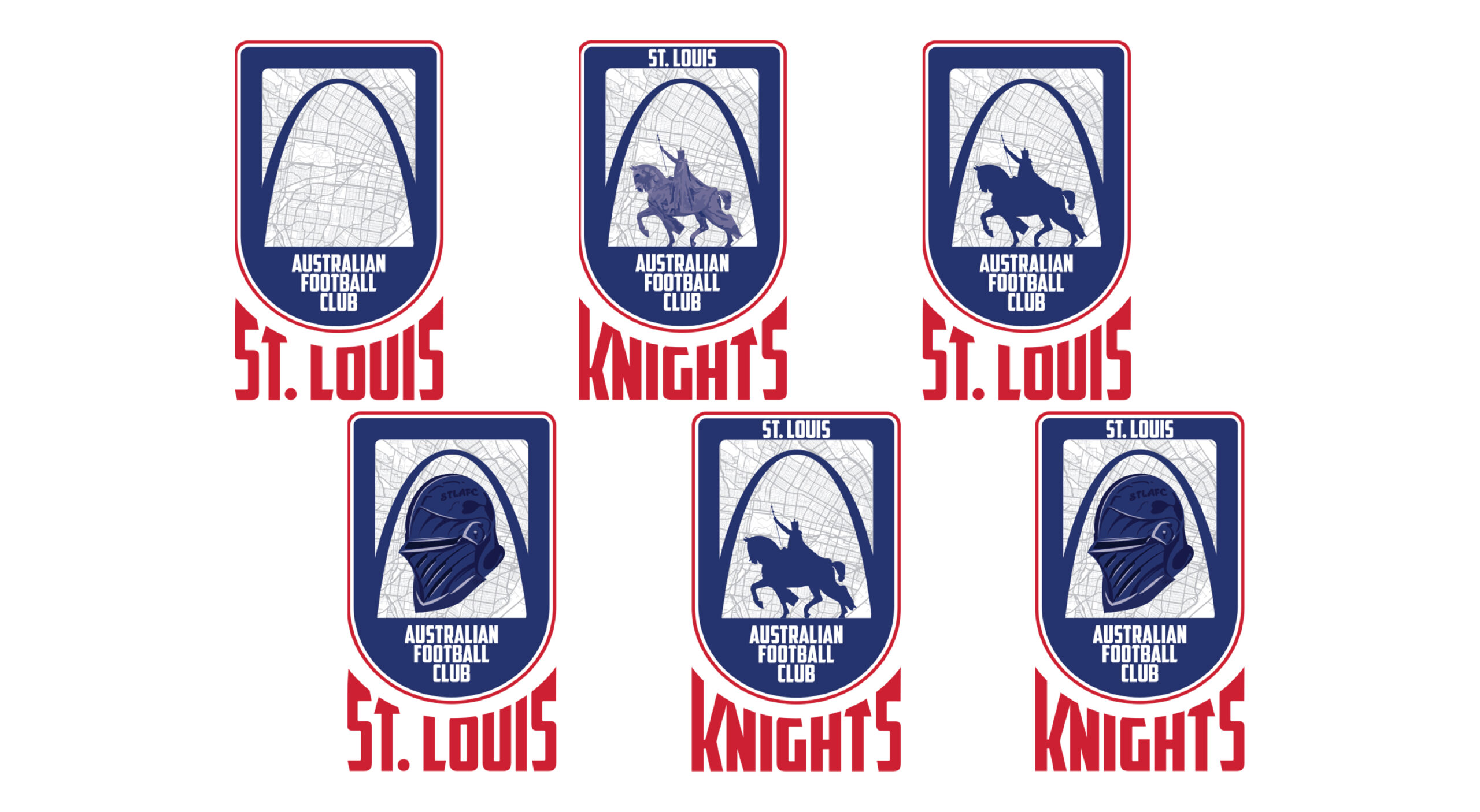
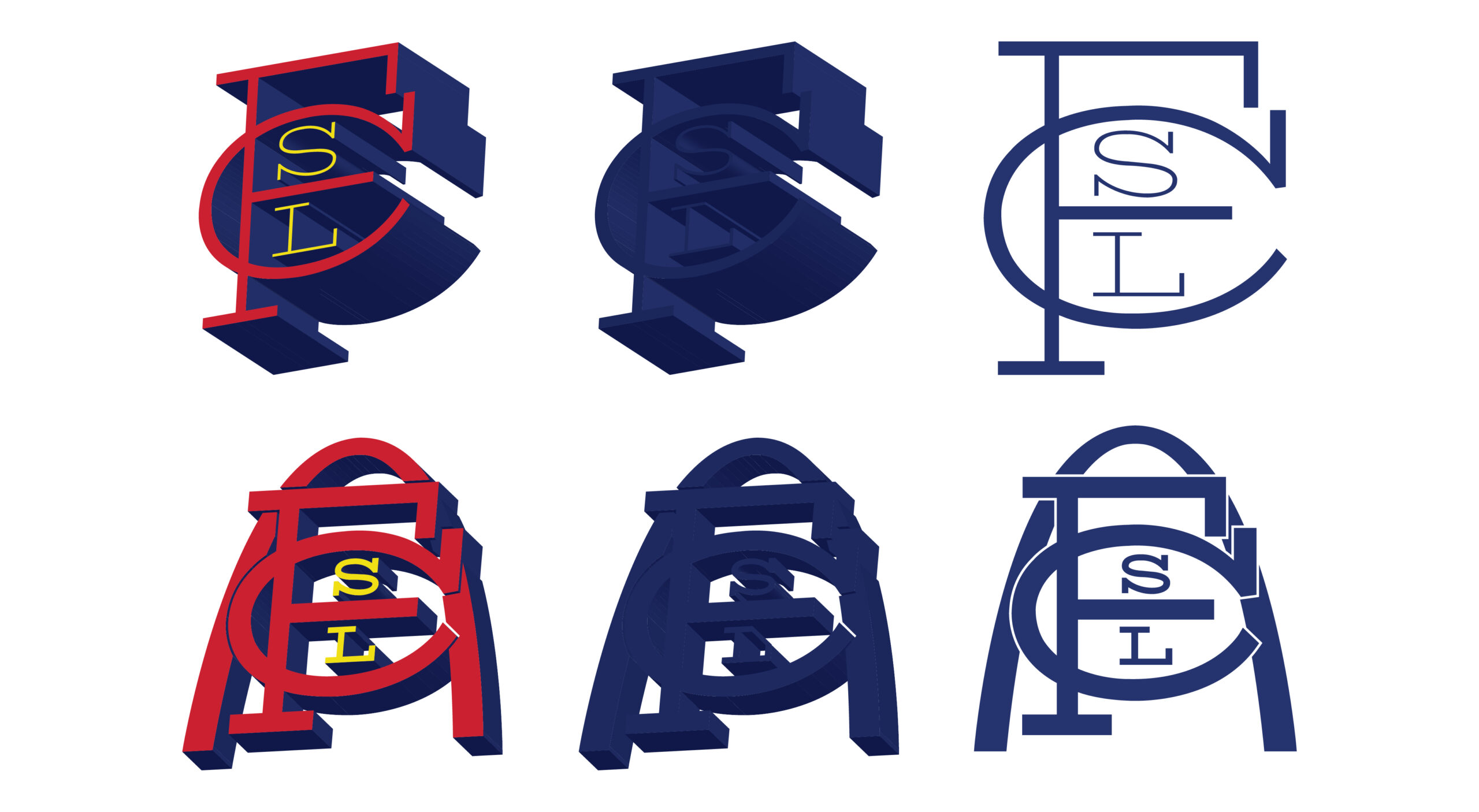
The St. Louis Australian Football Club approached me for a logo redesign that would give their brand a fresh identity. The goal was to create something that felt dynamic and athletic while also making a visual connection to the city of St. Louis. This was a fun and energetic brief that allowed room for creative interpretation.
Concept & Results:
I led the visual direction and design execution and focused on blending the toughness and agility of Australian football with visual cues that nod to St. Louis—using bold typography, a fierce mascot concept, and a color palette that bridges both sport and city pride. The final logo was well received by the client and their community, bringing a renewed sense of identity to the club. It was a rewarding project that pushed me to distill local culture into a clean, competitive design. My main takeaway? Strong visual storytelling can energize even grassroots sports organizations.