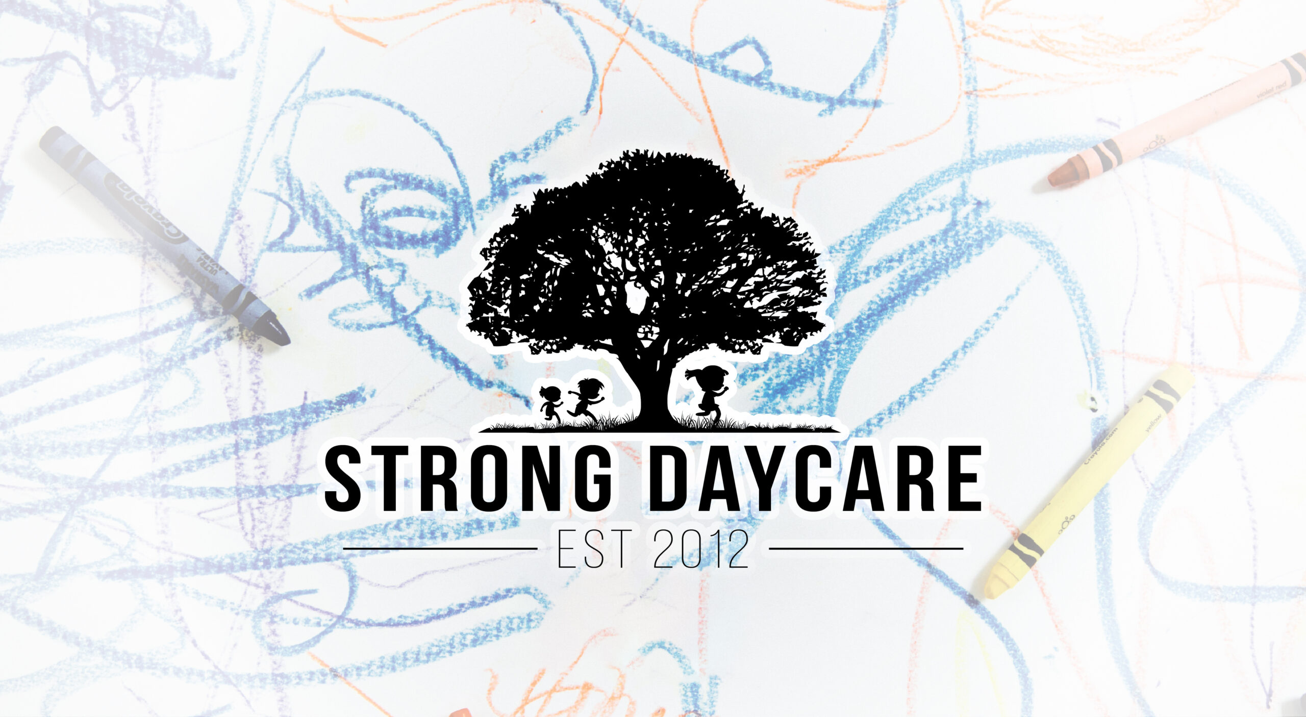
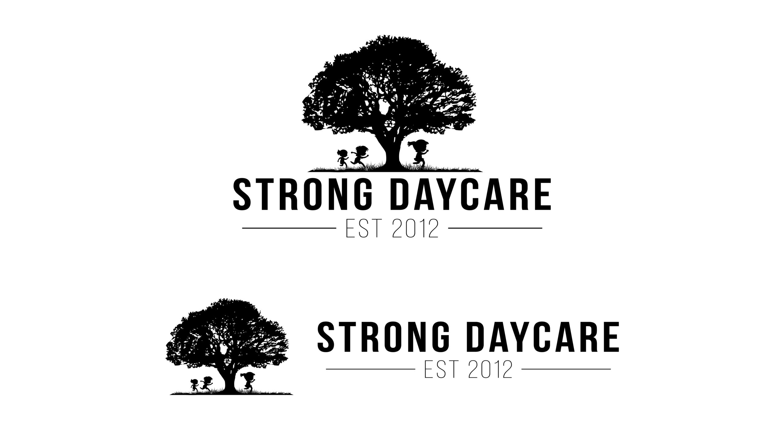
This logo design project was created for Strong Daycare, a childcare provider named after the owner. The goal was to develop a brand identity that visually reflects both the name and the nature of the business—strength and nurturing care for children.
Concept & Results:
The concept centered on combining symbolic imagery to represent both strength and childhood. I chose a sturdy tree as the focal graphic to evoke strength, stability, and growth—core qualities associated with the client's name and mission. To emphasize the daycare aspect, I incorporated silhouettes of running children around the tree, adding movement, joy, and a sense of play. The final result was a warm, memorable logo that successfully balanced the ideas of reliability and child-centered care. The client was very pleased with how the design captured the spirit of their business. This project was a great reminder of how visual storytelling can distill abstract ideas—like a name—into meaningful, functional design.