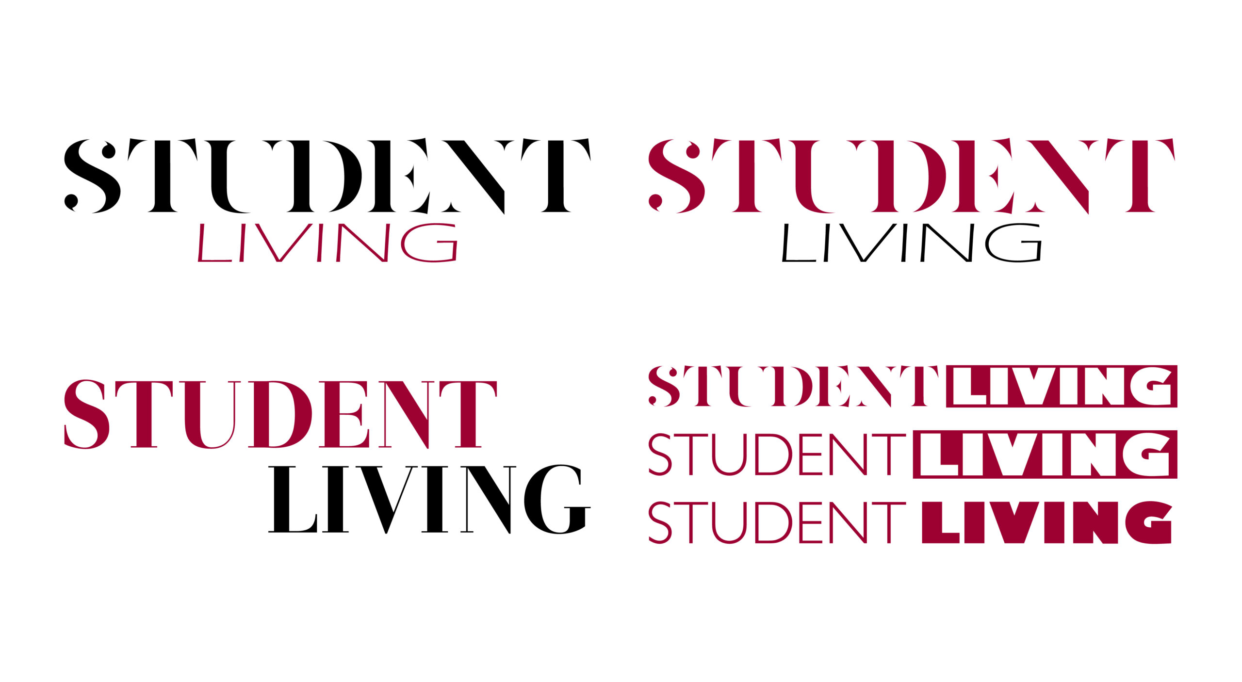
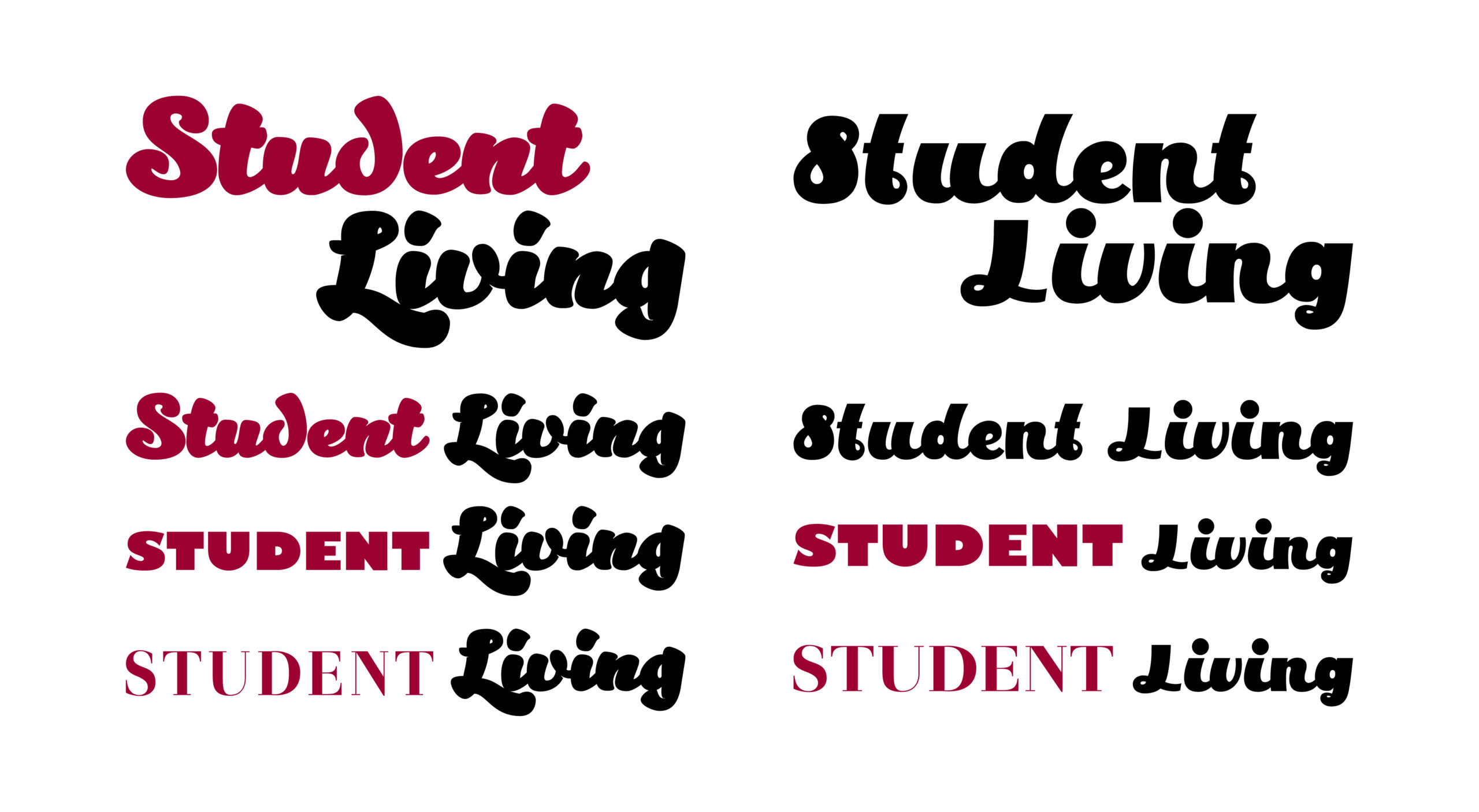
This project was a logo design study developed during my time at The Bryan-College Station Eagle newspaper. I was tasked with creating a visual identity for a new monthly magazine aimed at college students in the area. The magazine was intended to highlight student life, campus events, and youth culture in a bold and engaging way.
Concept & Results:
As the lead designer, I explored several typographic and iconographic approaches to craft a logo that would appeal to a younger demographic while remaining cohesive with the newspaper’s existing brand architecture. I worked independently on this project, with occasional feedback from the editorial and marketing teams. The final logo struck a balance between contemporary energy and editorial clarity. This project allowed me to sharpen my branding instincts, particularly in aligning design tone with a specific target audience. The success of the project was reflected in the magazine’s positive reception upon launch, and it remains one of my favorite early explorations in logo design.