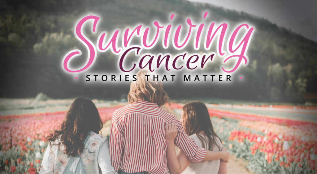
This project was a logo design study created for a magazine concept during my time at The Eagle Newspaper. The magazine aimed to support and empower women at any stage of their cancer journey, offering both inspiration and a sense of community. The brief called for a visual identity that would convey strength, compassion, and resilience, while remaining approachable and uplifting.
Concept & Results:
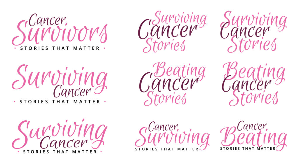
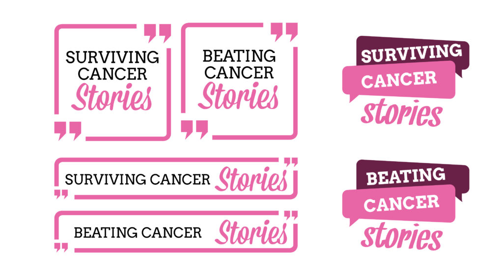
Collaborating with the editorial team, I explored several visual directions that could symbolize hope and solidarity. My role focused on researching visual language appropriate for the subject matter, developing initial sketches, and refining the chosen concept into a final mark. The resulting logo blended elegance with strength, helping set the tone for the magazine’s mission. This project was an important exercise in balancing emotional sensitivity with strong visual storytelling. One of my key takeaways was learning how design can play a quiet but powerful role in advocacy. The final logo received positive feedback for its warmth and clarity, and the experience strengthened my understanding of the designer’s role in purpose-driven publishing.